Aligning rebranding strategy with digital execution
Context
Motorola Solutions was undergoing its most significant transformation in decades, pivoting from a hardware-centric vendor to a unified safety ecosystem. As a core member of the strategic branding unit, I partnered with the VP of Brand and Global Marketing Leads to co-create the "Solving for Safer" identity from the ground up. My role was to ensure that as we defined this new mission, we were simultaneously building the digital experience to support it.
Role
Lead UX designer (Web & Digital brand)
Core focus
Digital brand translation & Design system optimization
Stakeholders
VP of communication & Brand, Global marketing leads, Deloitte engineering
Challenge
As a UX lead, I had to bridge the gap between "brand vision" and "technical reality." I led the redesign of our flagship pages while dealing with a legacy back-end that wasn't built for modern layouts, a culture that prioritized data density over user experience, and a very tight deadline for the global launch.
Discovery
I audited the existing site and identified four core barriers that were preventing the new brand from succeeding digitally.
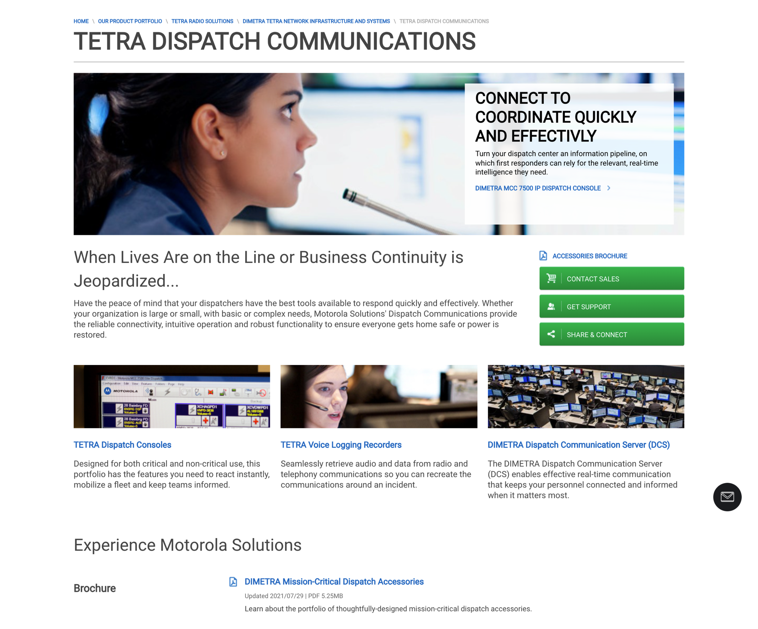
The "Quality" gap
Some parts of the website felt like a technical manual, which didn't match the premium, life-saving nature of our hardware.
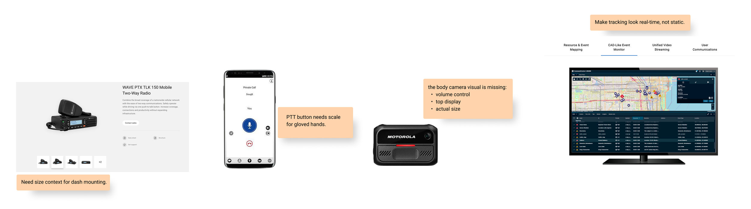
Poor media standards
I came across small, pixelated images that failed to show the technical details our customers need to see to build trust.
High cognitive load
Many pages relied on dense tables, making it difficult for users to quickly scan and process critical information.
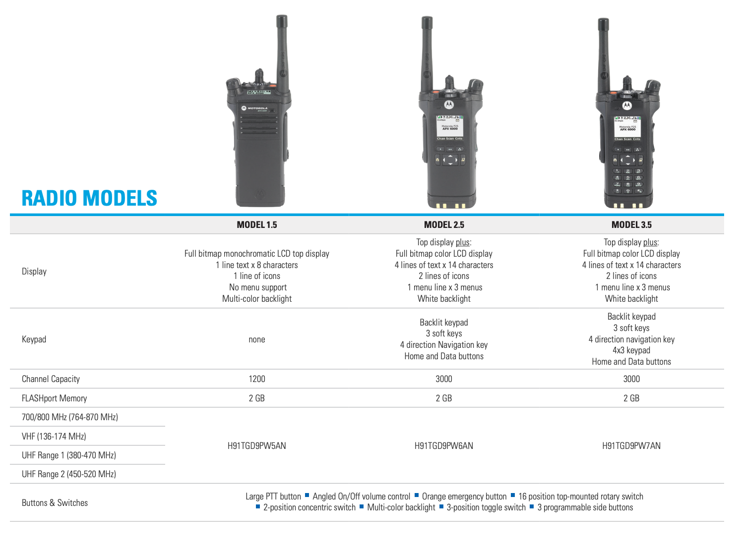
System Inconsistency
Various product pages used different design patterns, making the brand feel disconnected as users moved through the site.
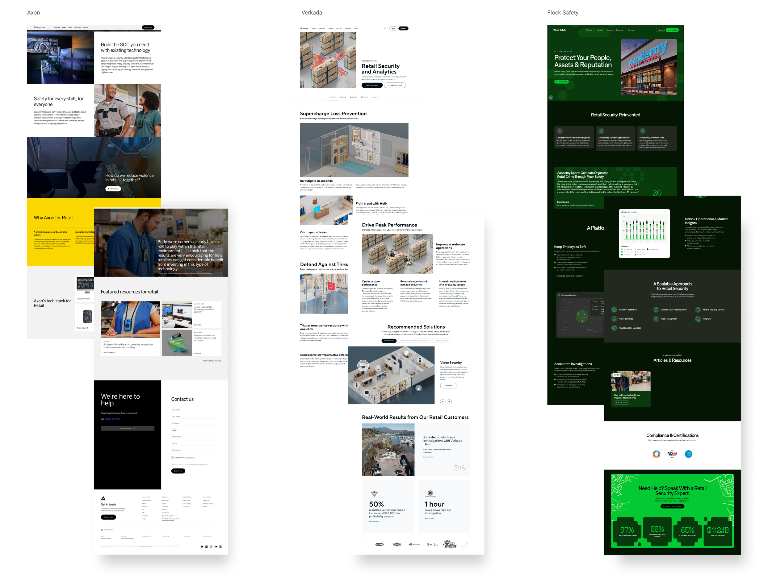
Competitive analysis
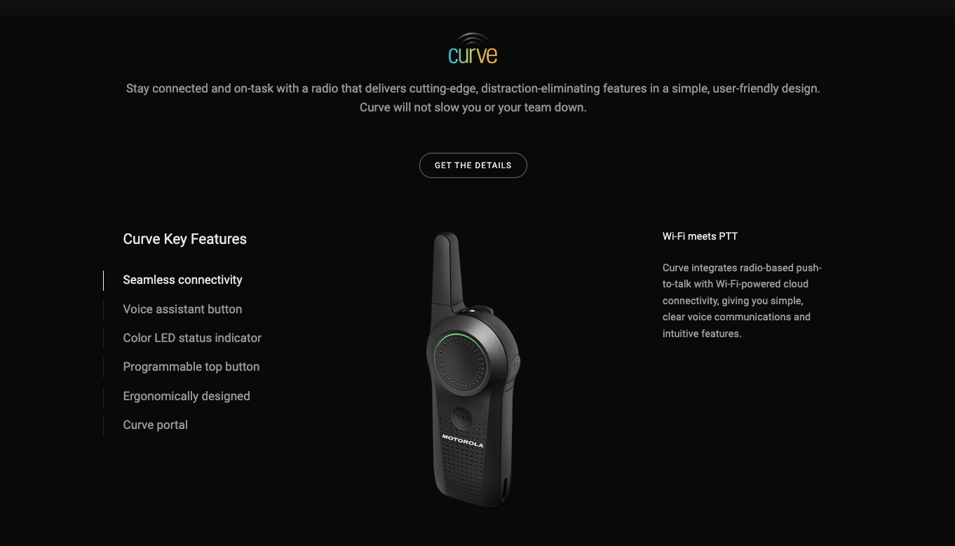
I compared our presence to Axon, Verkada, and Flock Safety, noting that they used bold typography, immersive imagery, and generous white space to project a tech-leader image. I used these insights to move Motorola away from 'hardware catalog' layouts toward a unified safety and security ecosystem that integrated voice, video, AI, and command center software into one single vision.
Insight
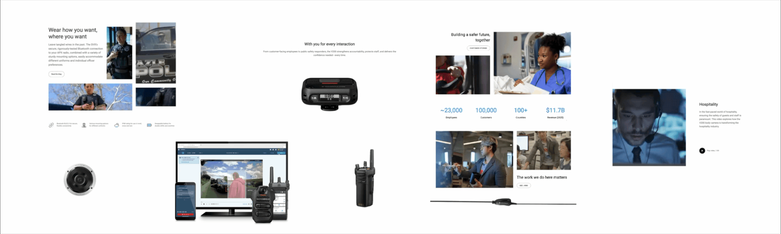
I interviewed our sales team and confirmed that static, blurry photos were hurting brand trust. I proposed replacing them with high-fidelity 360° renders, macro-texture shots, and side-by-side scale comparisons, so first responders could digitally 'feel' the device's durability before buying it.
Ideation
I prioritized intentional white space to reduce cognitive load and simplify navigation. Partnering with the Brand team, I introduced 360° renders, GIFs, macro-texture shots, and side-by-side scale comparisons, so customers could digitally 'inspect' a product before buying.
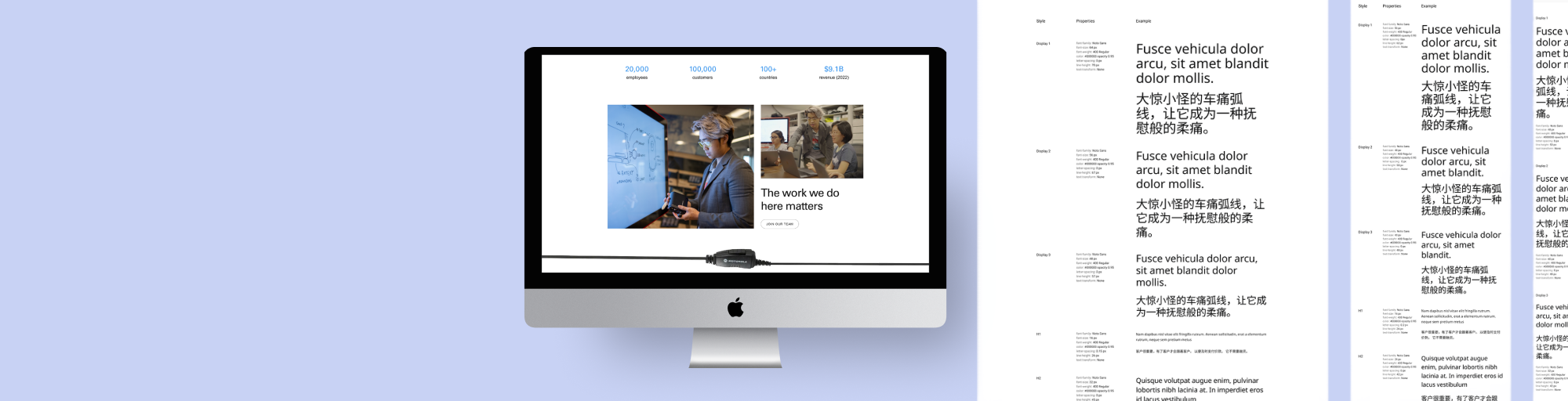
Architecture
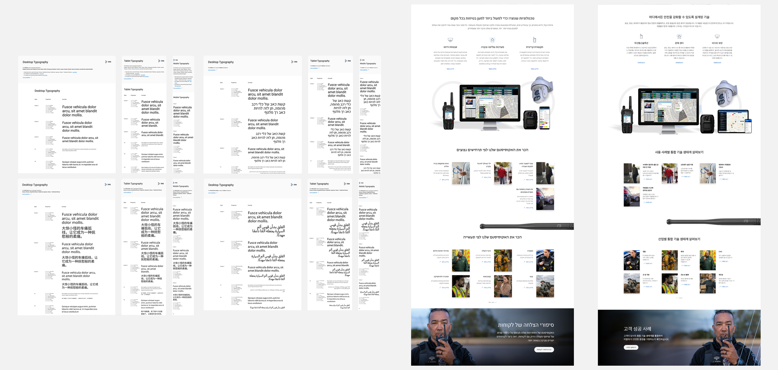
Replacing legacy fonts, I helped select and establish a new flexible type system to unify our web and software presence. Working across teams, I shifted our standards from all-caps to sentence case to improve scannability, defining the logic for how these styles adapt globally and remain stable across LTR (left-to-right) and RTL (right-to-left) layouts like Hebrew and Arabic.
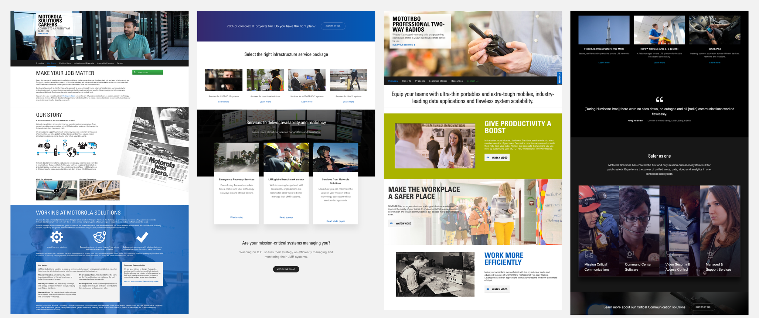
Implementation
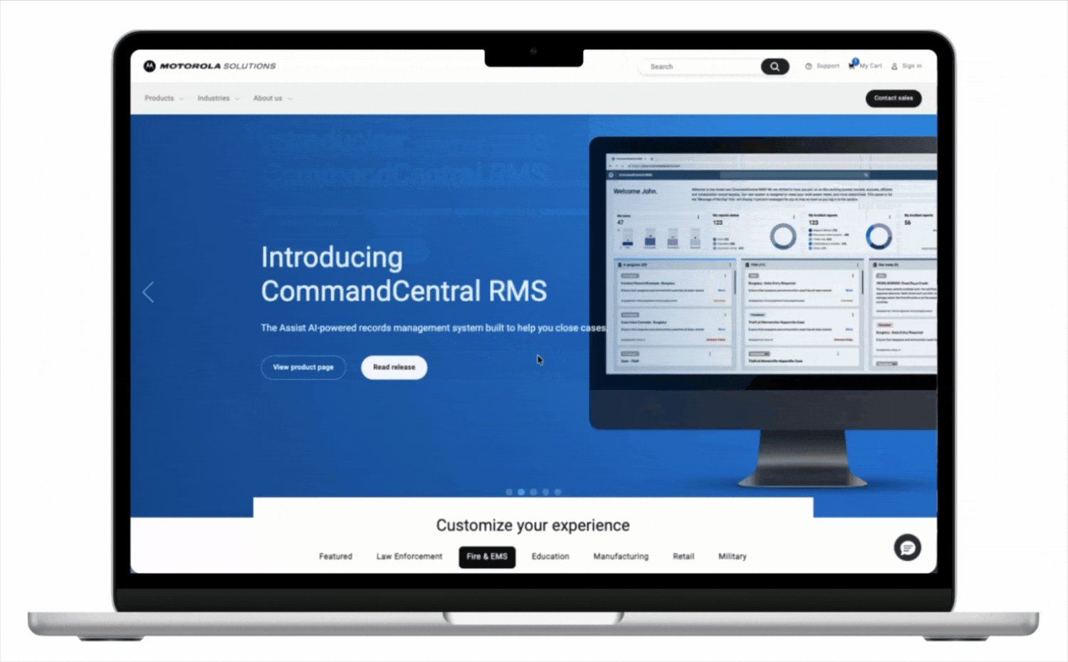
I led the redesign of the Homepage, About Us, and Careers pages to pilot our new standards. Partnering with developers from Deloitte, I guided these designs from initial concept to final launch, staying hands-on during QA to ensure the global rollout was stable and pixel-perfect.
Impact
Following the launch, I partnered with our analytics team to monitor live performance and validate our design decisions in real-time. By tracking specific link engagement and user flows, we confirmed that the new layout and typographic hierarchy directly drove a significant lift in global site discovery and engagement.

Next steps
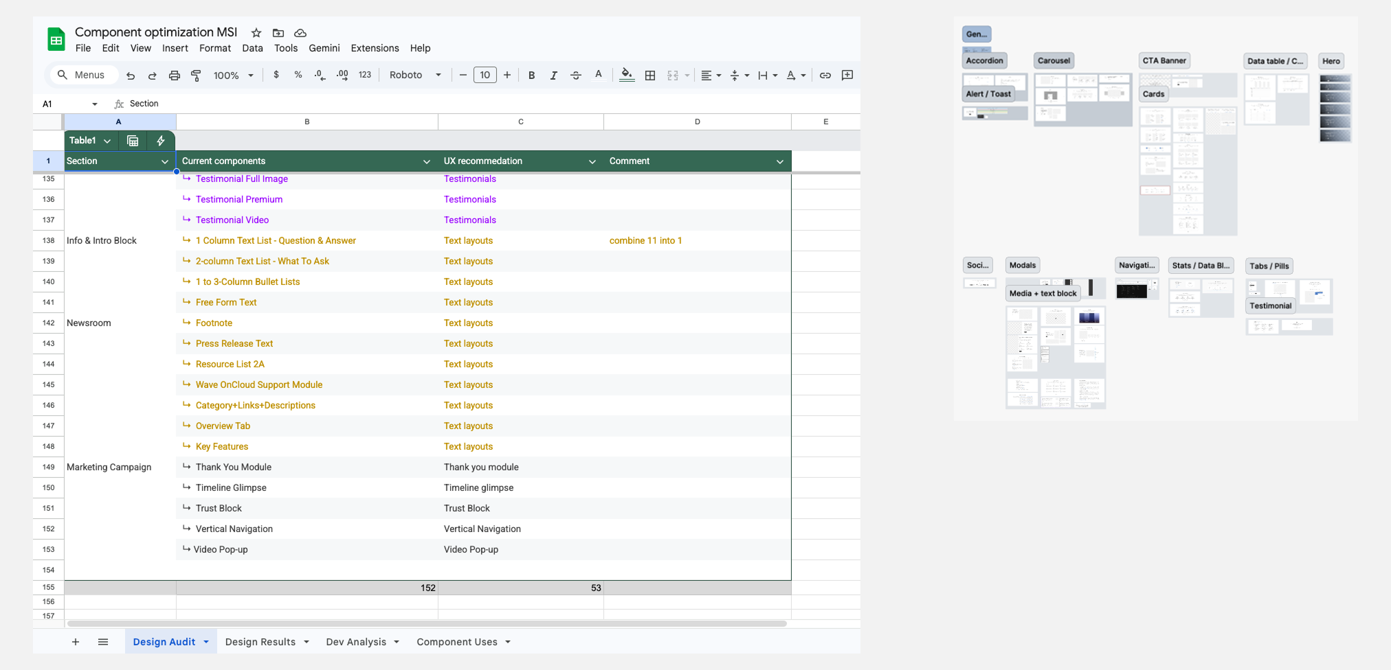
Once the core pages were live, my next focus shifted to an optimization of our design system. I began consolidating 150+ legacy components into 40 highly reusable components to eliminate redundant styling and simplify the handoff process for our development teams.
Lessons learned