Redesigning category page architecture

Context
Motorola Solutions has an industry-leading tech portfolio, but finding the right solution online felt like a fragmented digital catalog. This "wall of complexity" buried critical information, making it difficult for high-intent buyers to identify and compare the products they needed.
Role
Lead product designer, UX architect
Core focus
Path-to-purchase optimization, Information architecture, Stakeholder enablement
Stakeholders
VP of global marketing, SEO, Analytics, POs, and Dev team
Challenge
As a UX Architect, I was tasked to transform this fragmented catalog into a high-performance discovery engine. I led this structural overhaul while navigating limited development bandwidth and the lack of a centralized product data hub.
Discovery
To align the organization, I led a strategic session that unified stakeholders around data-driven priorities, resulting in specific KPIs and a clear technical roadmap for execution.
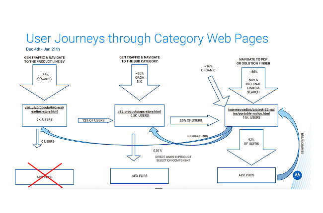
Engagement barrier
Heatmap data showed that 50% of users failed to scroll below the hero section on key category pages, missing vital product links.
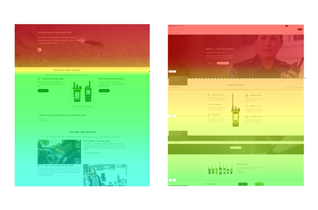
The "long path" to PDP
Legacy pages buried product links far down the page, requiring excessive scrolling and clicks to reach technical specifications (PDPs).
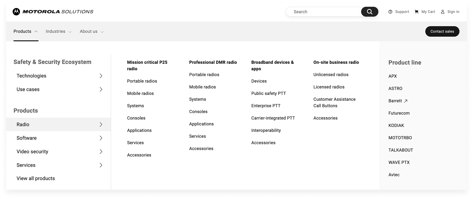
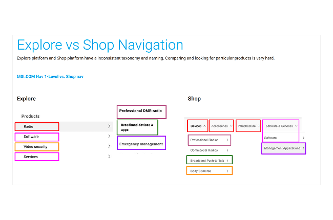
Taxonomy inconsistency
There was a profound lack of consistency between global regions and platforms; for example, naming conventions differed between the "Explore" and "Shop" platforms, causing user confusion during comparison.
Outdated UI and infrastructure
The absence of breadcrumbs and vertical navigation left users without a "sense of place," leading to high bounce rates in complex hierarchies.
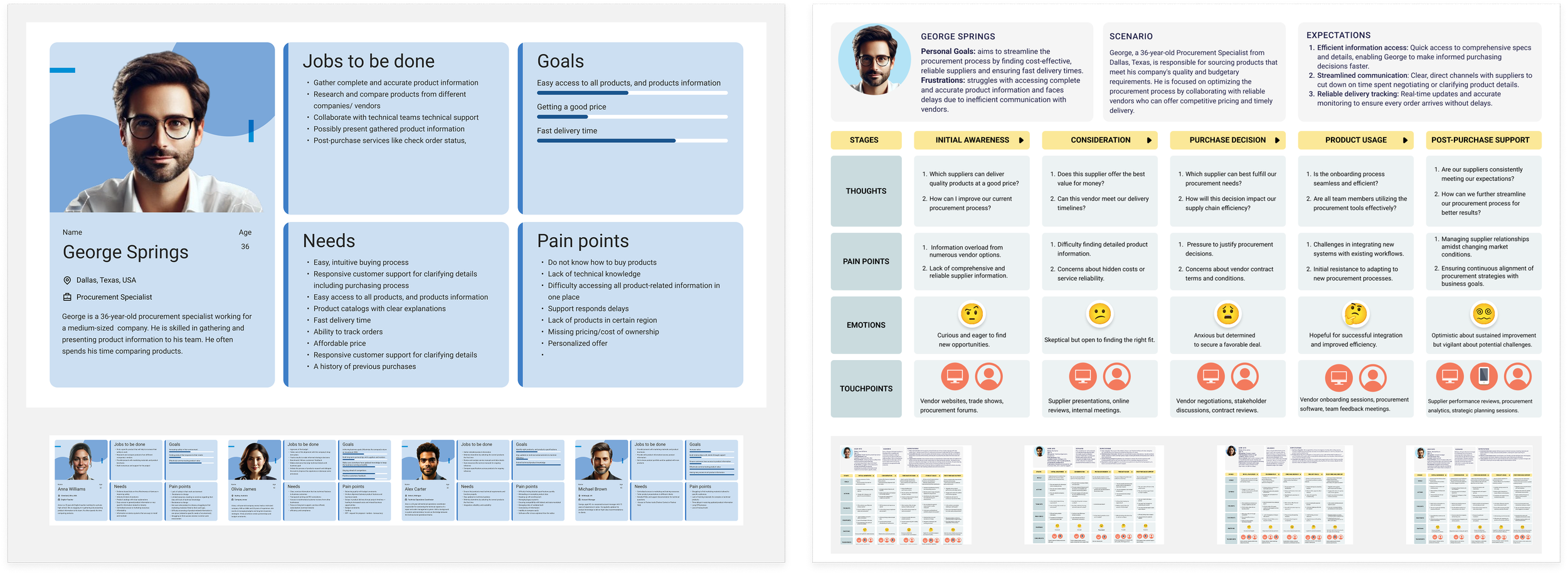
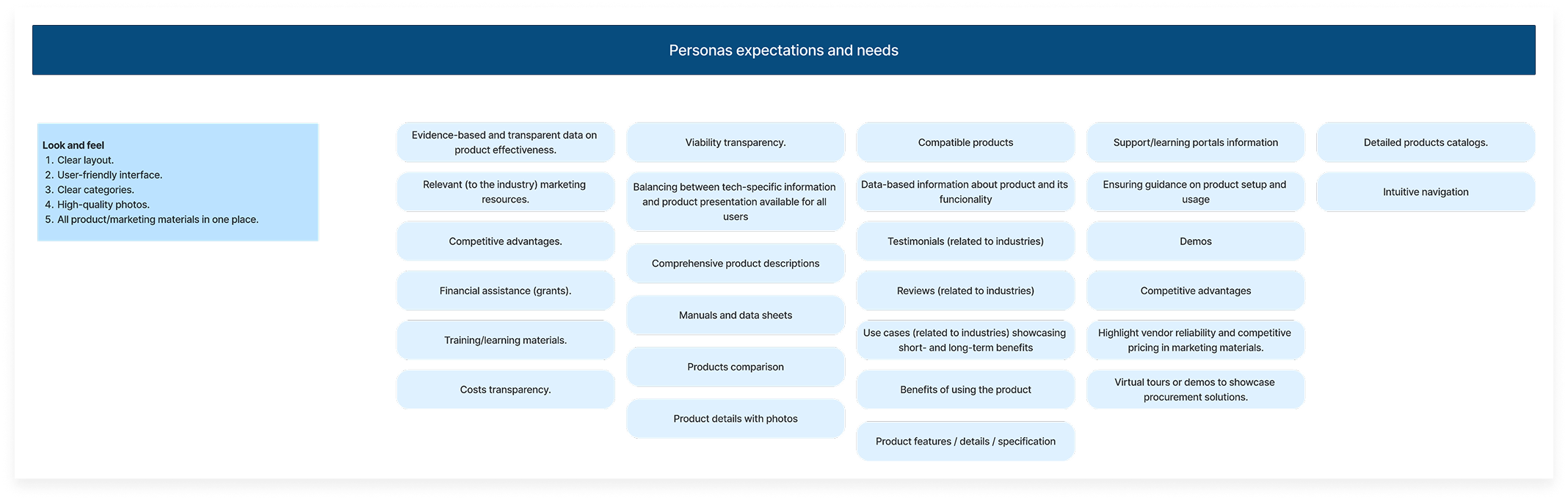
Personas & journey mapping
After starting persona discovery in our workshop, I used site data to flesh them out and refine our user journeys. This highlighted the specific areas where our current structure didn't align with their actual needs.
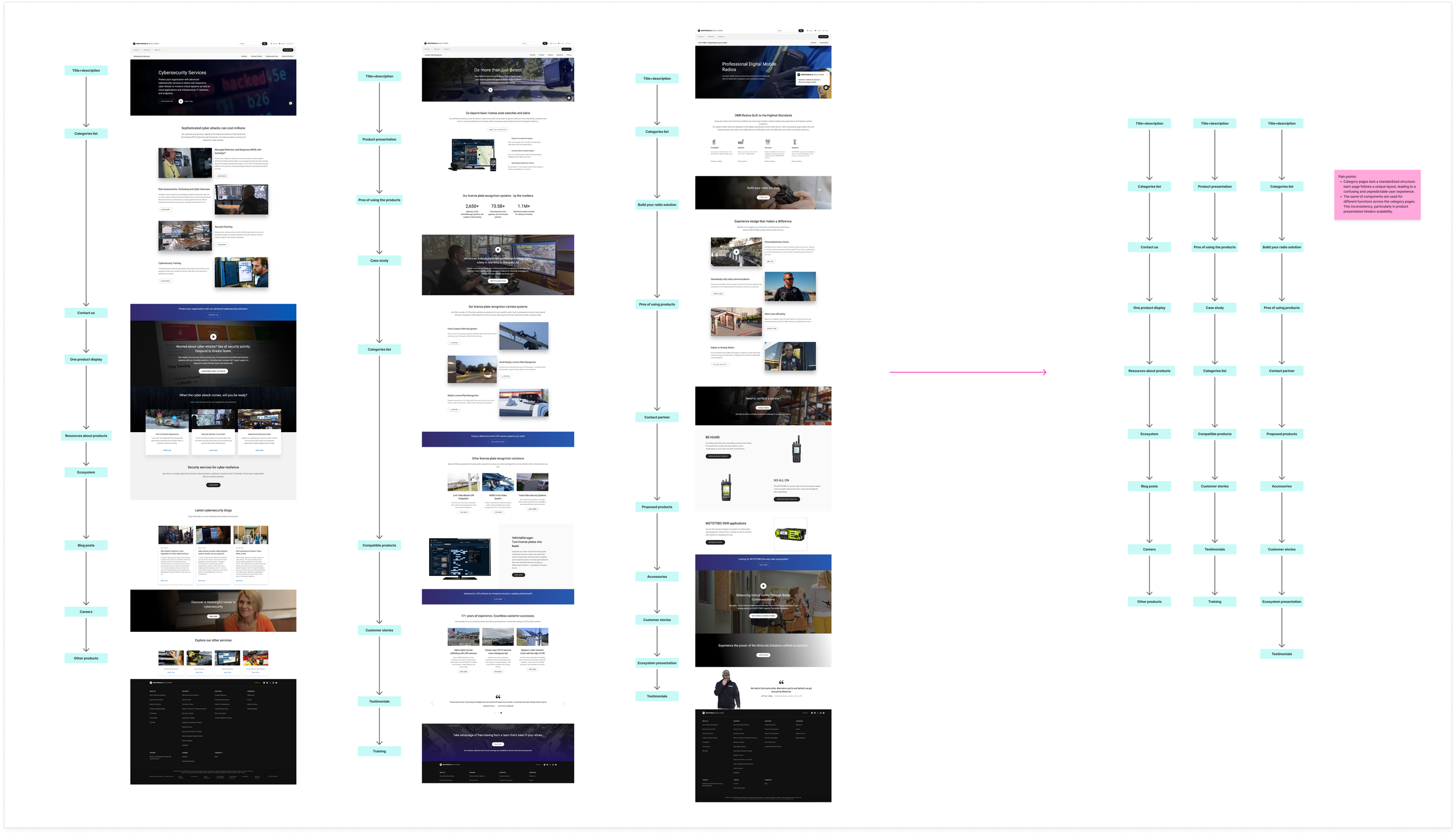
Ideation
I’ve identified repeatable patterns and defined key user expectations for category pages.
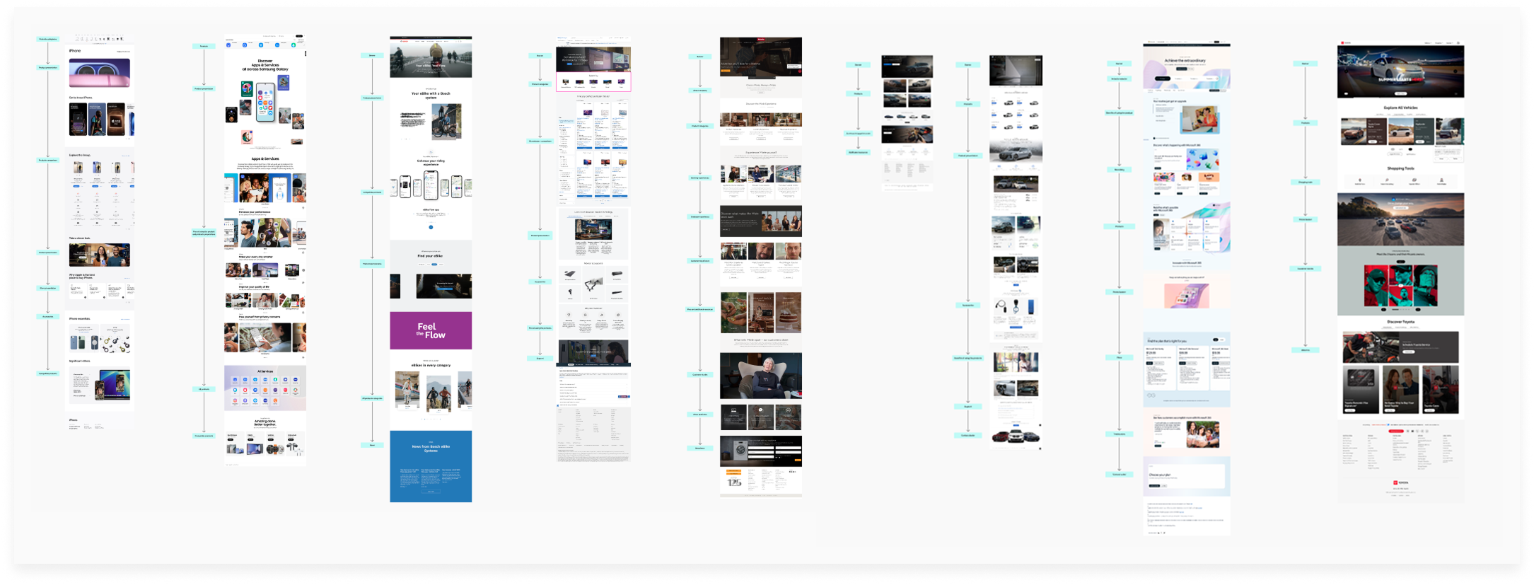
Competitive analysis
I conducted a competitive audit to understand how other global industry leaders structure their product categories and establish modern discovery standards.
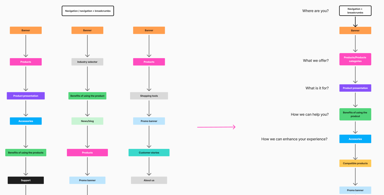
Information architecture
Using our research as a blueprint, I restructured the site architecture to reduce complexity. By simplifying top-level categories, I created a more intuitive hierarchy that aligns with how our customers actually search for solutions.
Strategy
While the vision was clear, we knew a total reorganization would take time due to back-end limitations. I collaborated with the developers to split the project into two phases: 'Quick wins' to boost conversion now, and a long-term plan to integrate a centralized data hub for a more robust site structure.
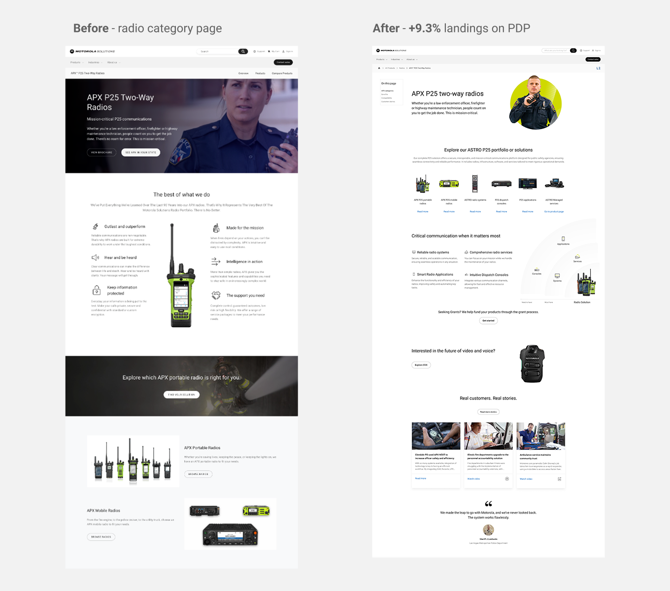
Phase 1: Quick wins
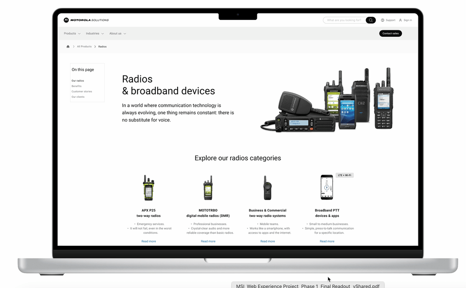
For the quick wins, I ran A/B tests on our existing AEM blocks to see where we could make the most impact. I found that, by simply moving the product selection higher up the page, we were able to shorten the user’s path to conversion and drive immediate engagement without needing a full redesign.
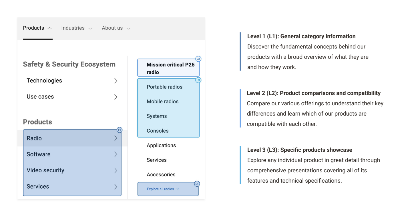
Phase 2: Long-term plan
To guide users deeper into the catalog, I defined three new page levels based on an analysis of our navigation structure: Level 1 for initial discovery, Level 2 for comparison and capabilities, and Level 3 for specific product showcases. This design architecture clarifies the journey from discovery to purchase.
Validation
Our initial A/B tests confirmed the hypothesis: shortening the path to key technical info worked. We saw an immediate jump in conversion rates, confirming that even small optimizations could deliver a big impact.

Execution
While our 'Quick wins' were already showing measurable success through A/B testing, we moved forward in parallel with the long-term plan to build a layout that will support advanced filtering the moment our data hub is ready.
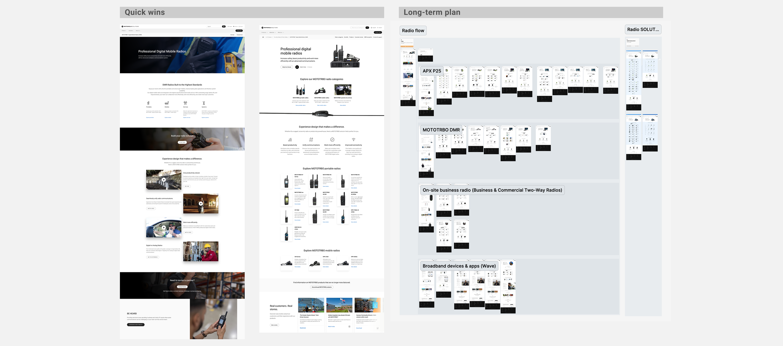
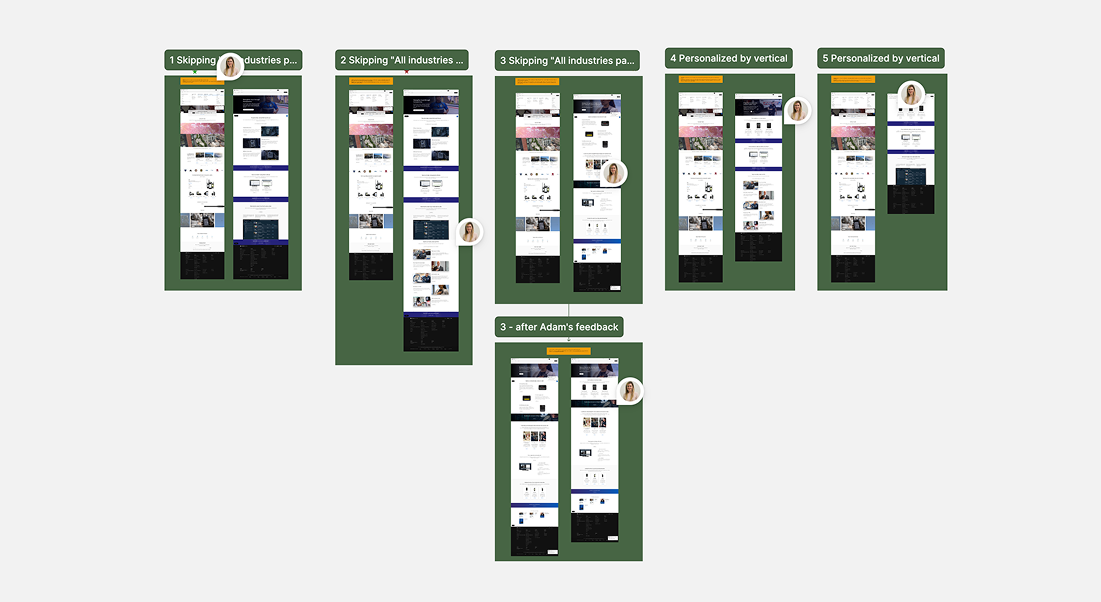
Execution
I focused on Level 3 pages, as that’s where our technical users make their final decisions. To make the experience feel less like a spreadsheet and more like a showcase, I replaced clunky text links with clean product cards, added a filtering sidebar, and refined the breadcrumbs for better navigation.

Next steps
The next phase is about scaling these validated patterns into a global standard. Once powered by our central data hub, the site will transition from a static catalog to an intelligent engine that serves the right product specs to users worldwide.
Lessons learned
This project taught me that you don’t have to choose between speed and quality. Using 'quick wins' as a proof of concept allowed me to deliver immediate value while building the trust needed to tackle the root problem and design a solution that can actually scale worldwide.